Navigating token design in partner locations
When you deploy tokens in a space you do not own, standard corporate branding rules quickly become a liability rather than an asset. A host venue carefully curates its visual environment, and introducing heavily branded items can create friction with their established aesthetic. Your goal in these shared spaces is to bridge the gap between your own operational requirements and the partner location’s environment. Taking an objective approach to token design ensures your hardware functions perfectly for users without imposing an unwanted corporate identity onto the host venue.
Identifying friction points with primary logos
Placing your primary logo on a physical token can easily confuse public users when that token operates within an entirely different host venue. Visitors naturally associate the visual cues they see with the space they are in, and an unexpected corporate logo disrupts that seamless experience. If a user receives a token in a partner location, they need to intuitively understand how to use it right there, rather than wondering who manufactured the item. Removing highly specific corporate branding prevents this cognitive disconnect and keeps the user focused on the immediate operational task.
Identifying these friction points early prevents costly design mistakes from reaching the manufacturing stage. A visually aggressive design not only risks confusing the end user, but it also creates hesitancy from the host venue during the approval process. You need smooth user adoption to make the shared deployment successful, and visual design directly impacts this operational workflow. Keeping the artwork subtle guarantees that your tokens blend naturally into the environment while maintaining the functional clarity your system requires.
Core elements of neutral token branding
Designing a neutral token requires you to break down the visual and physical elements into actionable parameters. These technical choices allow you to maintain your operational identity securely without overpowering the partner brand. Giving your technical decision-makers clear design guidelines ensures the tokens integrate smoothly into existing host environments. You can achieve this balance by focusing on standardized symbols, careful color choices, and precise typography.
Choosing universally recognised operational symbols
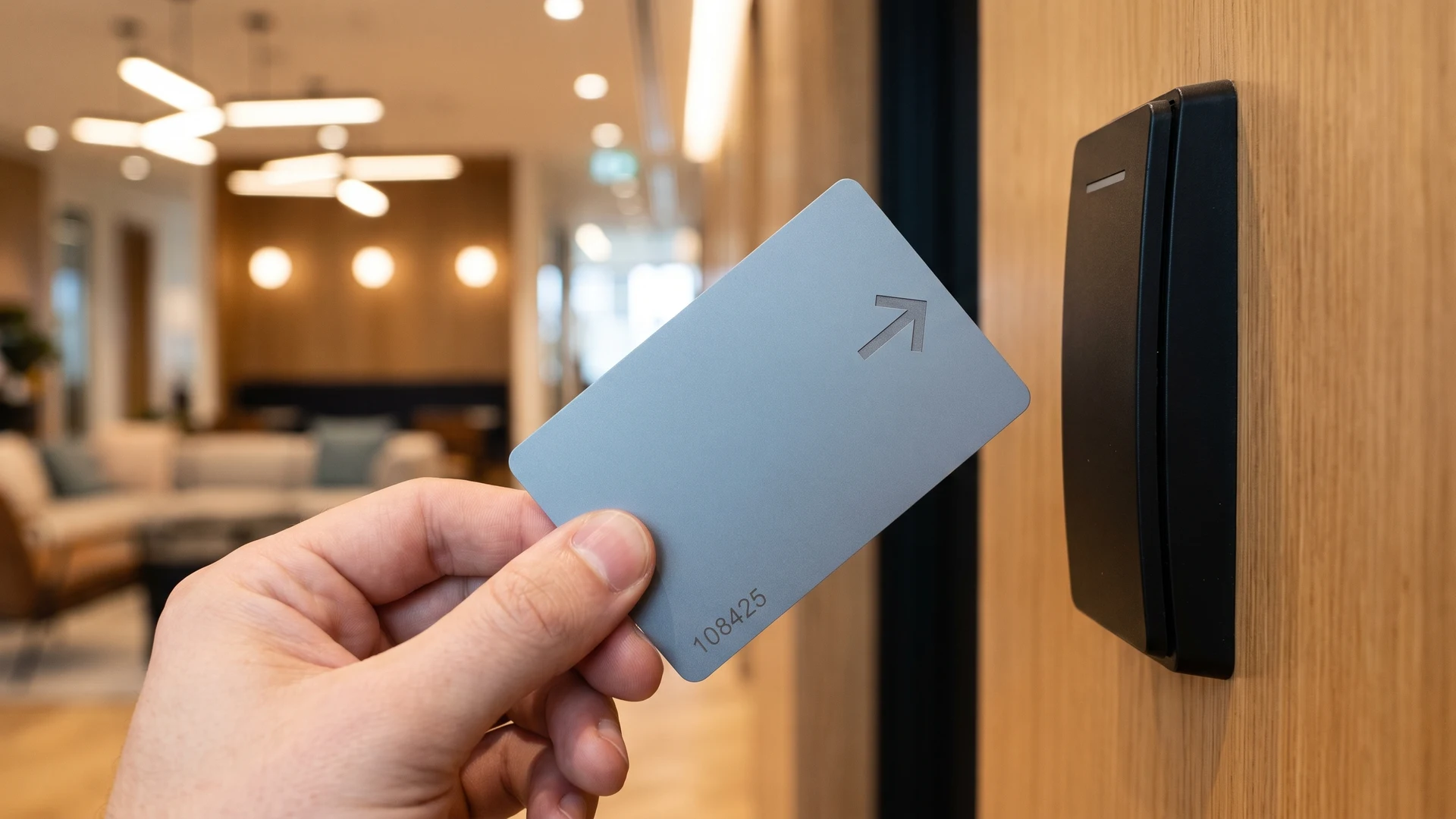
Selecting universally recognized icons helps users interact with your tokens correctly, regardless of their native language. The International Organization for Standardization (ISO) and the International Electrotechnical Commission (IEC) define standard symbols that guide safe and correct user interaction. Using established icons like a simple directional arrow or a standard information circle directs users without relying on localized text. These universal symbols transcend language barriers and provide immediate clarity in fast-paced shared environments.
Selecting complementary or subtle colour palettes
Subtle color palettes improve usability in multi-brand environments by establishing a neutral canvas that reduces visual noise. When a platform or physical space hosts multiple distinct entities, vibrant interface colors often conflict with individual brand identities. Soft tones like off-whites, cool grays, and soft charcoals ensure your token does not compete with the host venue’s primary aesthetic. This muted approach lowers cognitive load for the user and creates a more premium, trustworthy feel that positively influences interaction rates.
Maintaining essential technical text for scanning
If your token relies on automated scanning, you must tightly control the technical typography to ensure reliable data capture. Systems utilizing Optical Character Recognition (OCR) require clear, standardized text to isolate shapes and read alphanumeric codes accurately. You should strictly use industrial sans-serif typefaces like Arial or Helvetica, as these fonts maintain a uniform stroke width that scanners can easily process. Avoiding decorative fonts prevents thin hairlines from blurring under scanners, ensuring high-speed visual readers capture the data without errors.
The physical geometry of the text also plays a critical role in how well optical sensors read the information. You need to maintain a minimum font size of at least 1.5 millimeters, though aiming for larger text optimizes fast conveyor scanning. Increasing the default character spacing by twenty to thirty percent ensures that adjacent letters do not merge into unreadable blobs under the scanner light. Maintaining a blank border around the text area prevents misreads caused by the token’s physical edge or decorative rims.
Steps to align your design with host venues
Aligning your token design with a host venue requires a structured sequence for evaluating the shared environment together. Taking a collaborative approach builds trust and ensures the partner location accepts the proposed design without unnecessary revisions. This roadmap gives your implementation lead clear guidance on how to structure the alignment process and secure stakeholder approval. Following these concrete steps guarantees that the final physical tokens meet both your operational standards and the venue’s visual expectations.
- Assess the visual environment: Begin by mapping the existing color schemes, lighting conditions, and wayfinding signage at the partner location. You need to understand the baseline aesthetic so you can choose token materials and colors that complement the space. Documenting these environmental factors objectively gives you a strong foundation for proposing specific design elements later. This initial assessment prevents you from presenting a concept that blatantly clashes with the host’s carefully curated atmosphere.
- Define the operational requirements: Outline the exact technical features your tokens must retain, such as embedded chips or scannable text. You must clearly separate these non-negotiable functional elements from the flexible aesthetic choices before you present the design. Explaining why a specific font or symbol is necessary for system compatibility helps the partner understand your constraints. This transparency prevents stakeholders from requesting design changes that would compromise the token’s technical performance.
- Present neutral design prototypes: Provide the host venue with digital mockups or physical samples that feature the muted color palettes and universal symbols you selected. Presenting concrete examples makes it easier for the partner to visualize how the token will look in their space. You should highlight how the neutral approach respects their brand identity while solving your operational needs. This collaborative review phase allows both parties to discuss minor adjustments before committing to mass production.
- Formalize the design agreement: Document all final decisions regarding token dimensions, colors, and iconography in a shared specification sheet. Both your internal project managers and the host venue stakeholders must sign off on these exact parameters. Locking in the agreement objectively protects both sides and provides a clear blueprint for the manufacturing team. This final step ensures that the rollout proceeds smoothly without unexpected disputes over the physical appearance of the tokens.
Translating internal terminology for public users
Stripping away internal company jargon from your token artwork prevents user frustration and reduces the need for manual support. Your engineering and operations teams likely use specific acronyms to describe backend systems, but these terms mean nothing to the general public. When a user picks up a token, the printed instructions must guide them using plain accessible language. Translating complex internal terminology into simple action verbs ensures that someone who has never interacted with your central systems can still succeed.
Applying this logic directly to the physical token surface is critical because space is highly limited. You must explain any necessary technical terms clearly on the first use, or better yet, replace them with universal symbols that require no explanation. If a user encounters an unexplained acronym on a token, they will likely hesitate or use the item incorrectly, slowing down the entire operational workflow. Clear public-facing language builds confidence and allows your tokens to function seamlessly as intuitive tools in a shared space.
Managing token identity across different franchise models
Managing token identity across a complex network requires you to balance local franchise aesthetics with the strict necessity of central system integration. Different franchises often request slight visual variations on their tokens to reflect local campaigns or community ties. You must accommodate these local requests safely without compromising the backend tracking architecture that your entire operation relies on. Establishing clear boundaries for customization helps implementation leads scale multi-site deployments while keeping the central database perfectly synchronized.
Standardising base physical dimensions across sites
Standardizing physical dimensions is critical because automated token tracking systems rely on exact mechanical reliability and sensor accuracy. Automated sorters and validators use precise physical pathways, meaning even a microscopic variance in a token’s size can cause system-wide failures. Uniform thickness and diameter prevent tokens from getting stuck or overlapping during high-speed processing in shared hardware. By locking these base physical attributes across all franchise locations, you ensure seamless interoperability and drastically reduce maintenance costs associated with mechanical jams.
Adapting surface artwork per location safely
Adapting surface artwork safely requires you to understand how different application methods impact the physical durability of the token. Standard digital printing inks are susceptible to chemical attack and mechanical abrasion, which can quickly degrade custom local designs. If a franchise requires heavy visual customization, you should use protective overlaminates or clear patches to shield the printed artwork from physical wear. For environments demanding maximum durability, laser engraving offers a permanent solution that resists surface chemical attacks while maintaining a consistent aesthetic.
Tracking aesthetic variations in your central database
Centralized asset management databases allow you to track aesthetic variations using specialized metadata and version-control frameworks. You can assign descriptive tags to each token variant, such as regional color codes or local campaign names, enabling precise categorization. Creating a parent-child asset hierarchy lets you link a primary master record to multiple sub-variants, grouping different aesthetic styles under one profile. This structured tracking ensures your central system always recognizes a token’s technical validity, regardless of the unique visual skin applied by a local franchise.
A process for testing tokens in shared environments
Piloting new neutral tokens in a real-world host environment provides objective validation before you commit to a large-scale deployment. A structured testing approach helps you check user recognition and system compatibility in the exact context where the tokens will live. This methodology empowers project managers to identify unexpected friction points and adjust the specifications proactively. By following a reliable testing sequence, you reduce the risk of a full rollout failing and ensure a smooth operational launch.
- Select a representative pilot site: Choose a single partner location that accurately reflects the lighting, traffic flow, and demographic mix of your broader network. You need a testing environment that exposes the tokens to typical daily wear and standard user interactions. Running the pilot in a controlled but realistic setting gives you the most reliable data on how the neutral branding performs. This targeted approach prevents you from disrupting multiple venues if the initial design requires significant adjustments.
- Monitor user interaction objectively: Observe how first-time users handle the tokens without any external guidance or verbal instructions from staff members. You should track whether they intuitively understand the universal symbols and whether the neutral colors successfully draw their attention. If users hesitate or attempt to use the tokens incorrectly, you know the visual cues need further refinement. Gathering this behavioral data directly from the field removes guesswork and highlights exactly which design elements are working.
- Verify mechanical and technical compatibility: Test the tokens repeatedly through all automated readers, sorters, and scanners present in the shared environment. You must confirm that the physical dimensions trigger the sensors accurately and that the typography scans perfectly under the venue’s specific lighting conditions. Documenting any misreads or mechanical jams during this phase allows you to tweak the manufacturing tolerances before mass production. This technical validation proves that your operational requirements are fully intact beneath the customized aesthetic.
- Gather host venue feedback: Schedule a formal review session with the local franchise managers or host venue operators to discuss their observations. You want to ensure they feel the neutral design integrates well with their space and does not cause confusion for their customers. Listening to their practical feedback builds a collaborative relationship and often reveals small environmental details you may have missed. Incorporating their insights into the final design guarantees smoother acceptance when you roll the tokens out to other locations.
Finalising your specifications for partner rollout
Locking in your final token specifications based on pilot feedback transitions your project from the planning phase directly into active deployment. You must update your implementation documentation with the exact finalized dimensions, color codes, and universal symbols proven to work during testing. The RFID & NFC platform provides educational resources and objective knowledge to help you structure this final documentation confidently. If you need further clarification on industry norms, you can direct general inquiries to contact@rfidandnfc.com while executing a successful rollout across all partner locations independently.
How do we make token actions clear for people who do not know our brand?
Use universal symbols and plain words so someone new still understands what to do. The International Organization for Standardization and the International Electrotechnical Commission define proven icons like arrows, the information i, and warnings. Pair your symbols with short labels and high contrast. Keep your layouts simple.
Which colors help our tokens sit beside a host brand without clashing?
Choose a neutral base so the host brand can breathe. Use off whites, cool grays, and soft charcoal to reduce visual noise and stop color clashes. Add a small accent only where you need to cue state or priority. Always test legibility under real lighting and wear.
What text and engraving specs improve camera based reading on tokens?
Set your typography for optical character recognition, which is camera based text reading. Choose sans serif fonts such as DIN 1451. Aim for 3.0 to 5.0 mm text height, with 0.2 to 0.3 mm strokes and 20 to 30 percent spacing. Use a matte background and a quiet zone around.
Which artwork method gives the most durable finish on shared tokens?
Choose laser engraving for a lasting mark because it becomes part of the surface. Direct to card printing, which adds ink on top, wears fastest under friction. Retransfer printing is tougher, and overlaminates extend life from two years to five years or more. Choose composite bodies to resist warping.
How can franchises localize token branding without losing consistency?
Lock your core elements like the logo, colors, and base layout, then give franchisees templates with controlled local fields. A Digital Asset Management system, which stores and governs brand files, tracks versions and enforces approvals. Use metadata and parent child asset records to group regional variants cleanly.