Defining the purpose of your token artwork
Every printed element on a Radio Frequency Identification (RFID) or Near Field Communication (NFC) token should serve a distinct practical purpose within your deployment environment. Your implementation team needs these physical credentials to act as intuitive guides that help users navigate the system without requiring constant technical support. While incorporating your company logo maintains visual consistency, the primary goal is ensuring that the physical token visually communicates its function and access logic. Prioritising operational deployability over purely decorative branding means your final hardware will actively prevent user errors and keep your daily workflows running smoothly.
Matching visual elements to operational needs
Breaking down the available space on your tokens helps your project manager assign a clear operational role to every piece of printed information. You can use this objective framework to decide exactly when visual branding adds value and when simple instructional text is necessary for your users. Evaluating your design choices based strictly on utility ensures that the token aligns with the existing workflows your team relies on daily. Structuring the artwork around these core operational needs prevents unnecessary clutter and keeps the user focused on the intended action.
Logos for quick identification
Placing a clear logo on your token allows security staff and employees to verify genuine credentials instantly from a distance. This immediate visual recognition reduces the need for manual intervention at busy access points, which keeps your traffic moving efficiently. Bold graphics make authentic passes stand out clearly against counterfeits or outdated visitor badges without requiring a close physical inspection. When you use your brand visually as a security feature, you enhance the overall integrity of your facility while maintaining a professional appearance.
Short text for user instructions
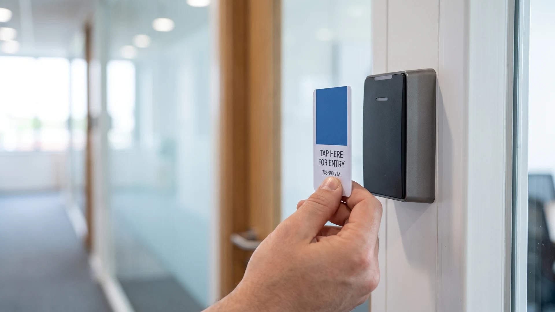
Including concise instructional text directly on the token provides your users with immediate guidance on how to interact with your digital readers. Adding short phrases like tap here or present to scanner reduces the cognitive load on visitors who are unfamiliar with your specific technology setup. This direct communication eliminates confusion at access barriers and ensures that users hold the chip correctly against the terminal. Supplying these simple directions on the hardware itself significantly decreases the number of questions your frontline staff have to answer during a busy rollout.
Simple codes for campaign tracking
Printing a numerical code or unique serial number on the token surface gives your team a reliable backup method for tracking physical hardware. These simple visual identifiers allow your administrators to match a specific physical card to a user profile in your database without needing to scan the embedded chip. You can use these printed sequences to conduct quick physical audits or to log temporary visitor passes during large-scale campaigns. Having a visible reference number ensures that your support team can resolve access issues quickly even if the digital system experiences a temporary offline period.
Supporting physical access levels with token design
Visual indicators on your access tokens help your security staff quickly verify identity and spot unauthorized visitors without relying solely on digital scans. Incorporating clear color coding allows your team to define specific building zones intuitively, such as using blue for general office spaces and yellow for restricted areas. These colored elements serve as immediate visual cues that guide authorized people to their correct destinations while signaling restricted boundaries to everyone else. Matching your employee lanyards or visitor badges to these specific zone colors enables guards to identify out-of-place individuals instantly.
Printing specific role labels and user names on the token surface prevents costly security mistakes and gives administrators immediate feedback on clearance levels. Adding large text that designates a user as staff or a temporary visitor stops your security team from having to guess someone’s permission status in a crowded hallway. High-contrast designs and universal symbols like shields or locks reinforce these access tiers visually, which reduces the cognitive load on your personnel. This distinct visual hierarchy ensures that your physical tokens perfectly match the digital access logic configured in your underlying software systems.
Steps to map your artwork to system operations
Planning your token artwork alongside your technical deployment requires a concrete sequence to ensure that every printed element serves a valid system function. Following a structured method helps your implementation lead manage the design phase confidently without letting unnecessary branding clutter the final product. You can apply these practical steps to align the physical design with your digital infrastructure and eliminate guesswork for your users. Taking this systematic approach guarantees that the resulting tokens will integrate smoothly into your established facility workflows.
- Assess your operational bottlenecks: Before you finalize any visuals, you must map out where your current access or payment processes experience delays or user confusion. Identifying these friction points allows you to determine exactly what information needs to be printed on the token to guide the user successfully. Addressing these specific gaps ensures that your artwork actively solves a problem rather than just occupying blank space. This initial review sets a clear functional baseline for your entire design project.
- Define your visual hierarchy: Once you understand the operational gaps, you should organize your printed elements based on what the user needs to see first. Prioritizing critical instructions and color-coded access zones above standard brand logos keeps the credential easy to read at a glance. Establishing this clear order of importance prevents the hardware surface from becoming overcrowded and confusing for your frontline staff. A strong visual hierarchy directs attention exactly where your system requires it during a live transaction.
- Assign functional roles to graphics: You must evaluate every logo, icon, and text block to confirm that it supports your digital deployment in a measurable way. Removing any design element that does not assist with wayfinding, security verification, or user instruction helps maintain a clean and practical layout. This strict utility test guarantees that your physical tokens remain focused entirely on system operations and deployability. Stripping away decorative excess leaves your team with a highly efficient tool that improves the daily user experience.
- Validate the design in your environment: Testing your proposed token artwork under the actual lighting and usage conditions of your facility reveals whether the visual cues work in practice. You can use these physical walk-throughs to verify that security guards can distinguish color zones from a distance and that users can read the instructional text easily. Gathering this practical feedback allows you to refine the contrast and font sizes before you commit to a large manufacturing run. This final verification step ensures that the approved tokens will function perfectly alongside your digital readers from day one.
Finalising a functional design for your rollout
Wrapping up the design phase with a utility-first mindset gives your technical decision-makers the confidence to approve tokens that genuinely support your digital infrastructure. You can move into the manufacturing stage knowing that your physical hardware will actively assist your users and reduce operational friction at every touchpoint. Relying on objective educational resources like RFID & NFC throughout this process ensures you make pragmatic choices that align with your specific deployment needs. Ultimately, a well-planned visual design transforms a simple piece of plastic into a critical operational tool that keeps your facility running efficiently.
What information should every access token include?
Print a unique identifier and clear issuer branding, then add the role or zone the holder belongs to. For Radio Frequency Identification, or RFID, mirror the database record with the printed serial. Use color blocks or icons for fast checks. Avoid personal data unless you also include a photo.
How do I prioritize limited space on a small token?
Start by defining the token’s single job, then rank content by how it supports that job. Put the primary cue first, such as a role label or zone color. Keep a short code as the backup reference. Use high contrast and a legible size you can read at a glance.
What is a practical color coding system for access levels?
Limit the palette to three or four distinct colors and keep meanings consistent across sites. Pair each color with a text label or icon for people who cannot distinguish hues. Match badge colors to door signs and lanyards. Choose high contrast so guards recognize levels from a distance.
How should a printed code link to my database?
Decide on a code standard that maps directly to a database record. Use a simple prefix for zone or role plus a fixed length serial, and add a check digit to reduce errors. Avoid characters like O and 0 together. For Quick Response, or QR, codes maintain strong contrast.
How do I use tokens for campaign tracking responsibly?
Treat each token as a trackable unit without exposing identities. Print a campaign identifier and a unique serial that your system resolves to date, venue, or offer details. Use Quick Response, or QR, codes for quick self capture when appropriate. Set clear expiry and decommission codes promptly to prevent reuse.