Communicating value and entitlement through token branding
Physical tokens serve as the direct touchpoint between your users and your service infrastructure, making clear visual communication an essential part of the design process. When you embed specific markings directly onto a token, you give users an immediate understanding of what they hold without asking them to consult external guides. This functional approach to token branding goes beyond simple aesthetics by reducing user friction at the point of physical interaction. Your implementation leads can use these intuitive design choices to guide user behavior naturally and improve the overall efficiency of your operations.
Visual cues for physical single use tokens
Designing basic physical tokens requires a structured approach to visual communication before you introduce any digital complexity to your system. You can use foundational design elements to indicate worth and usage limits clearly to your end users. Establishing these visual rules early ensures your team builds a consistent physical vocabulary across your facility. This straightforward branding strategy prepares your project managers to handle more advanced digital infrastructure later in the rollout.
Text and number assignments
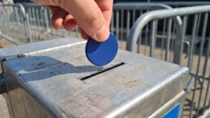
Assigning explicit text and numerical values to physical tokens provides the most direct way to communicate immediate worth to your users. When you stamp a specific access limit or entitlement directly onto the surface, users know exactly what the token allows them to do. This clear numbering system prevents confusion at entry points and helps your staff verify access quickly during busy operational periods. You can establish clear usage boundaries simply by ensuring the printed information matches the exact service tier the user purchased.
Color and material distinctions
Introducing distinct colors and materials allows your team to differentiate token tiers instantly without requiring users to read small text. You can assign premium materials to higher access levels so users feel the increased value the moment they hold the token in their hands. This physical property strategy helps your staff visually audit crowds from a distance to ensure everyone remains in their permitted zones. Grouping these visual identifiers logically ensures your base-level tokens function perfectly as a standalone access solution.
Shifting value to the system with radio frequency identification
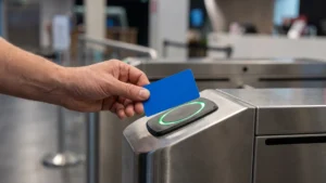
Moving from simple physical tokens to digital access solutions requires an understanding of how radio frequency identification (RFID) changes where value actually lives within your infrastructure. An RFID tag contains a small microchip that holds a unique identification number rather than storing the actual value or entitlement on the token itself. When a user presents the tag, the RFID reader sends radio waves to capture this unique identifier and transmits it through middleware software to your central server. Your backend system then uses that identifier as a key to look up the user’s specific access rights in a connected database.
This shift means the intrinsic physical value of the token disappears, making visual branding critical to bridge the gap between digital data and human trust. You must design these digital tokens carefully so users recognize their purpose instantly and feel confident tapping them against your reading terminals. Distinct branding also provides your staff with a reliable visual audit method to verify access if your digital scanners temporarily go offline. Using high-quality printing techniques adds an extra layer of security that makes it significantly harder for unauthorized individuals to replicate your physical tokens.
Designing visual indicators for digital system tokens
When the actual entitlement lives in a backend system rather than on the physical object, your token design must prevent user confusion while maintaining system flexibility. You need to create logical visual systems that complement your technical infrastructure without promising fixed physical value that might change later in the database. Empowering your implementation leads to establish clear visual rules ensures the physical branding accurately reflects the digital access levels. This alignment helps your users navigate your services intuitively while your database manages the complex entitlement logic behind the scenes.
Generic identifiers for flexible use
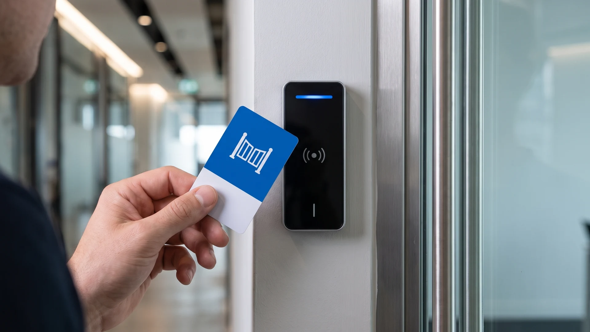
Using generic identifiers allows your team to assign different roles to the same physical token over time without needing to issue new hardware. You can brand these tokens with broad categories or universal logos that make sense regardless of the specific digital permissions assigned in the backend. This approach prevents the visual design from contradicting the database if a user upgrades their service level mid-cycle. Your project managers benefit from ordering these generic tokens in bulk while retaining complete control over the digital access rights.
Visual cues for service tiers
Establishing clear visual cues for different service tiers helps both users and staff instantly recognize the level of access granted by the digital system. You can apply specific border colors or distinct patterns to separate standard entry tokens from premium access credentials. This visual separation reassures users that they received the correct tier while giving your security personnel an easy way to monitor restricted areas visually. Designing these visual tiers thoughtfully prevents you from overcomplicating the token face with unnecessary technical details.
Status indicators for user confidence
Incorporating strong status indicators builds essential user confidence when interacting with an otherwise invisible digital transaction. You want your users to feel certain that the branded token they hold corresponds legitimately to the digital currency or access they purchased. Professional branding signals security and legitimacy, making users much more comfortable tapping their token against an unfamiliar terminal. These visual status elements transform a basic piece of plastic into a trusted key that reliably connects the user to your backend system.
Steps to implement your token branding strategy
Developing a successful token branding plan requires a concrete sequential process that aligns your physical design with your technical system capabilities. You can follow these structured steps to define a rollout strategy that addresses both user expectations and your backend infrastructure requirements. Breaking the process down into logical phases gives your project managers an actionable roadmap to integrate tokens smoothly into your daily operations. This structured implementation ensures you avoid common deployment pitfalls and launch a cohesive visual system across your facility.
- Analyze your system capabilities: You must first evaluate whether your tokens will hold intrinsic physical value or rely on a backend database to verify digital entitlements. Understanding this technical constraint allows your team to determine exactly what information needs to appear physically on the token surface. This foundational evaluation prevents you from designing visual indicators that conflict with how your hardware readers process the transactions. You can then map out the specific access zones or service tiers your design must visually represent to your users.
- Define your visual vocabulary: You need to select the specific colors, materials, and generic identifiers that will represent each distinct user role within your facility. Establishing these visual rules ensures your physical branding communicates clearly without requiring users to read complex instructional text. Your implementation leads should verify that these design choices scale logically across all your planned access levels. Documenting this visual vocabulary gives your staff a reliable reference point for conducting quick visual audits during daily operations.
- Coordinate the rollout sequence: You should introduce your new token designs to your staff and users in phases to minimize disruption to your existing workflow. Training your personnel on what the visual cues mean ensures they can confidently verify access and assist users from day one. You can monitor the initial deployment closely to identify any points of friction where the physical design fails to match the technical reality. Following this controlled rollout sequence helps your team refine the token experience before scaling the solution across your entire organization.
Rounding off your approach to token design
Aligning your physical branding with both user expectations and technical systems remains the most critical factor in a successful token deployment. When you treat visual design as a functional communication tool, you build immediate user confidence and significantly reduce operational friction across your facility. The educational resources at RFID & NFC are designed to help you evaluate these objective solutions and implement them confidently within your own unique environment. Your project managers now have the practical guidance needed to make informed design choices that perfectly complement your underlying access infrastructure.
What are simple ways to show single-use value on a physical token?
Print a big numeral and a short phrase like Single use or Admit one so people read it at a glance. Pair it with a clear icon for the service, such as a laundry basket or a gate symbol. Use a strong color band for the day or zone.
How do I communicate changing balances when value is stored in an RFID or NFC system?
RFID means radio frequency identification, and NFC means near field communication. These technologies store value in your system, not on the token. Print a serial number linking the token to the account, and show the balance on the RFID reader screen. Use tiers like Day pass to set expectations.
Which words and numbers should I print to make entitlements clear?
Use plain labels that match how people think about usage. Prefer 10 rides, Day pass, Staff access, or Zone A only over internal product codes. Place the number first, then the unit, to aid quick scanning. Add expiry or non transferable notes only when they prevent confusion.
What visual design choices help staff verify access quickly and reduce fraud?
Give each tier a distinct color, icon, and large role text so staff can spot it quickly. Add serial numbers and features like holograms or ultraviolet print to deter copies. Train staff to do a visual check before using the RFID reader. Let the system deny out of zone taps.
How can I keep branding consistent across cards, wristbands, and mobile credentials during a phased upgrade?
Create a language of color, icon, and naming in your brand guidelines. Use the same serial number format on cards and wristbands that appears in the mobile pass. Choose RFID readers that accept both physical tokens and phone taps. Tell people on signage that each format grants the same access.