Finding the balance between token function and brand visibility
A successful token design requires your team to weigh the operational needs of your hardware against the visual impression you want to leave on your users. The physical surface of a token acts as a communication tool that guides users on how to interact with your system while the internal components carry the necessary technical data. If you prioritize visual elements too heavily over functional specifications, you risk confusing the users or compromising the data readability of the token. Conversely, focusing entirely on technical data can leave your users with an unbranded and generic physical object that feels disconnected from your organisation. Finding the right compromise ensures your systems register interactions instantly, guides your users clearly, and reinforces your visual identity at every touchpoint.
Common layout options for organisation branding and functional data
When you design the layout for your tokens, dividing the visual space thoughtfully helps you accommodate both your visual identity and your technical requirements. The front and back surfaces offer distinct opportunities to communicate with your users and provide essential instructions for system operation. Your team can allocate this space using several established layout strategies that balance aesthetic appeal with practical functionality. Choosing the right layout depends entirely on your specific operating environment and the amount of technical data your hardware requires for reliable operation.
Prioritising a bold logo forward design on the front
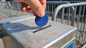
Allocating the entire front surface of your token to a bold logo creates an immediate visual connection with your users. This layout works exceptionally well in environments like gaming or public access venues where you want the token to serve as a strong extension of your brand identity. A dominant visual element helps users quickly identify the token in their pockets and associates the physical object with your organisation instantly. Because this approach leaves no room for instructions on the front side, you must ensure your system interactions are intuitive enough that users do not need printed guidance.
Applying subtle branding for professional environments
In corporate workplaces or secure facilities, a more restrained visual approach often aligns better with the professional atmosphere of the environment. You can incorporate subtle branding elements like a small edge logo, a monochromatic color scheme, or a standardized organizational emblem instead of an overwhelming design. This subdued strategy leaves ample physical space on the token for printed identification numbers, department codes, or return instructions that your staff might need daily. Providing this functional text directly on the front surface helps your team manage access rights efficiently while maintaining a clean and professional aesthetic.
Structuring the reverse side for clear machine data
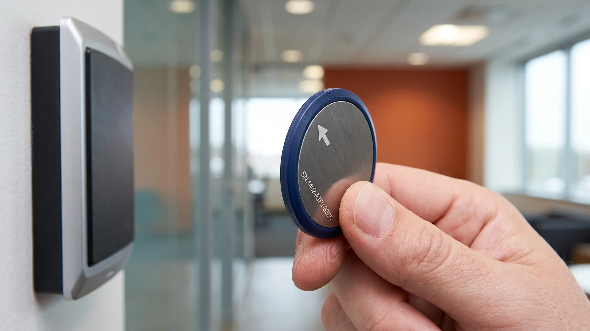
The back side of your token serves as the ideal location for mandatory technical details and system interaction instructions. You can use this space to print essential machine compatibility codes, contact information, or directional arrows that show users exactly how to insert the token into your equipment. Separating the functional data from your primary branding prevents visual clutter and ensures that critical operational information remains highly legible. By dedicating the reverse side strictly to operational guidance, your system interactions become smoother and your users experience fewer errors when operating your hardware.
Steps to choose the right branding approach for your system
Selecting the optimal design for your tokens requires a systematic evaluation of your user needs and your technical environment. You can navigate this decision confidently by following a structured evaluation process that prioritizes functionality alongside aesthetics. Breaking the decision down into logical steps ensures your team accounts for all operational variables before finalizing the physical layout. This systematic approach guarantees that your final tokens will operate flawlessly in your machines while representing your organization appropriately.
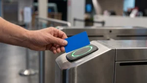
- Assess your operational environment: Begin by evaluating the physical space where your users will interact with your system. If your tokens operate in high-volume public areas, a bold and recognizable design helps users distinguish them quickly from other items. For secure corporate offices, you should lean toward a subtle design that blends naturally into a professional workplace setting. Analyzing the environmental context first establishes a clear baseline for how visually prominent your tokens actually need to be.
- Determine your required technical data: Next, you must list all the functional information that absolutely needs to appear on the physical token itself. Calculate the space required for serial numbers, instructional arrows, or compatibility marks that ensure the token functions correctly with your hardware. If your system requires extensive operational text, you will need to reserve the entire reverse side for this data and limit your branding to the front. Understanding your data requirements early prevents you from creating a beautiful design that leaves no room for essential technical instructions.
- Finalise the visual layout split: Once you understand your environment and data needs, you can confidently divide the available surface area on your tokens. Assign your core brand elements to the most visible surfaces while reserving the secondary spaces for necessary operational text. If you need objective guidance on technical specifications, educational resources like Radio Frequency Identification (RFID) & Near Field Communication (NFC) can help your team clarify those operational requirements. Finalizing this visual division ensures your tokens strike the perfect balance between clear brand visibility and flawless machine operation.
What information should take priority over branding on a dual use token?
Put the functional details first. Show denomination or access role, clear orientation cues, and a short serial or code for support queries. If the token uses Radio Frequency Identification (RFID) or Near Field Communication (NFC), still include human-readable identifiers for fallback. Keep contrast high and reduce clutter.
Where should I place the logo so it does not interfere with machine use?
Keep critical machine-facing areas clear. On coins, avoid deep raised logos near the rim that change thickness. On RFID or NFC tokens, keep metal foils away from the part that houses the antenna. Place the logo on the opposite face or centered, leaving a clean reading area.
How can I make branding subtle yet durable on a token?
Use small, high-contrast marks that wear well. Laser marking on metal creates permanent detail without thick layers, and shallow raised or recessed detail with rounded edges resists chipping. A tone-on-tone matte finish with a small monogram reads clearly in good light yet stays quiet at a glance.
When is a neutral, no-logo design the better choice?
Choose neutral when tokens move across sites, brands, or partners. A plain face with only the function and a compact code reduces replacement friction and discourages casual theft. It also fits regulated settings where strong branding could look promotional, keeping the focus on access and accountability.
How should we test layout, legibility, and compatibility before production?
Build quick prototypes and run field trials. Apply printed stickers to unmarked tokens, then test with gloves, low light, and hurried use. Cycle samples through coin mechanisms and any RFID reader you use, record misreads and confusion, then adjust spacing, contrast, and placement before committing to full production.