Understanding token branding across user journeys
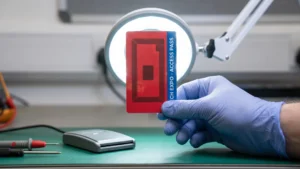
Approaching token branding as a functional tool rather than a purely cosmetic decision gives your team a direct way to reduce user confusion across your entire facility. When you treat the physical token as an active participant in your access control system, every visual element serves to guide the user naturally through their required actions. A well-designed token communicates its purpose instantly through shape, colour, and layout, which prevents bottlenecks at critical entry points. By aligning the visual design with the practical steps your users take, you ensure that the physical touchpoint supports the seamless integration of the broader technical system.
Mapping user interaction points from start to finish
Auditing your facility’s specific workflow before you finalise any token designs provides a concrete framework that prevents expensive deployment errors. You need to map out exactly where and how a user receives, holds, and eventually returns the hardware to understand the physical demands placed on the token. Documenting this complete chronological sequence reveals the exact moments where users might hesitate or struggle with the technology. This practical process audit helps your project manager identify the functional requirements that must dictate the final visual branding.
- Initial issuance: The moment a user receives the token at a reception desk or automated kiosk sets the baseline expectation for how they should handle the device. Clear visual indicators at this stage prevent immediate confusion and keep your initial queuing areas moving efficiently. You can use distinctive colours or prominent logos to establish trust immediately upon handover. This first contact determines whether the user feels confident approaching your access barriers.
- Active transit: Users carry the token through various environments where it might be stored in a pocket, held in a hand, or attached to a lanyard. The physical design must accommodate these carrying methods while remaining easily accessible for repeated interactions. Anticipating how the hardware travels between read points ensures the branding remains visible when it is actually needed. Your team can specify durable finishes that withstand this constant handling without degrading the visual instructions.
- Final return: The end of the user journey requires a clear process for depositing or deactivating the temporary token so it re-enters your system correctly. Distinctive exit branding guides users to the correct drop-off bins or return slots without requiring staff intervention. Planning this final interaction carefully lowers your ongoing implementation costs by reducing the volume of lost hardware. You maintain a stable inventory when the design itself prompts the user to return the item.
Designing for first contact and initial pickup
The issuance phase represents the most critical moment for user education, because this is where simple design choices immediately answer basic questions about how the system works. When a user first picks up the token, the visual layout should instinctively tell them which side needs to face the reading device. Incorporating subtle tactile elements or directional graphics onto the surface prevents individuals from fumbling with the hardware at your reception desks. This proactive approach to the initial pickup creates a smooth workflow that integrates effortlessly with your current ticketing processes.
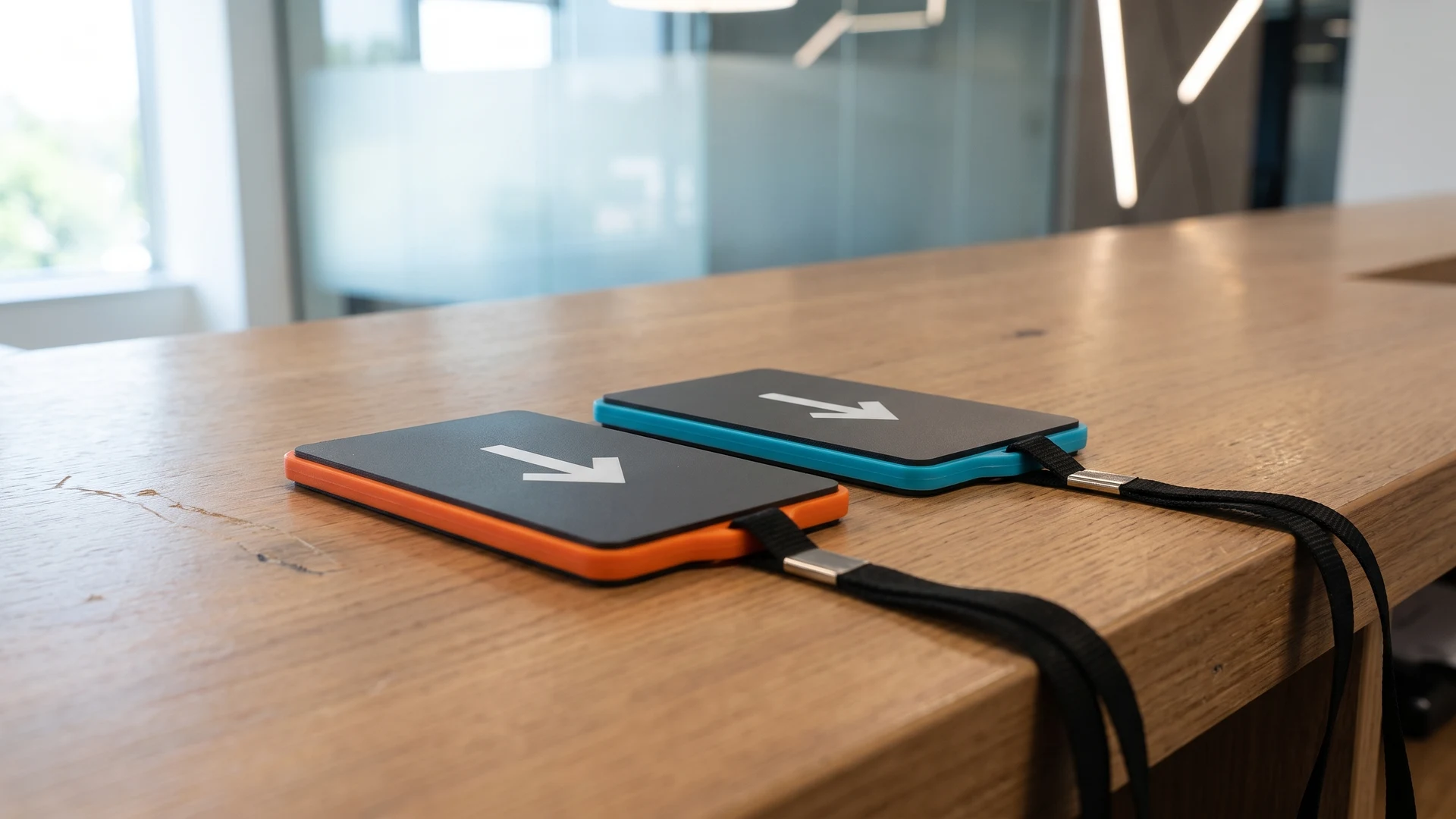
Providing clear visual cues during this initial handover eliminates the need for your staff to explain the process repeatedly to every new visitor. You can use contrasting colours on the front and back of the token to demonstrate the correct orientation instantly. When the physical design guides the user automatically, you remove the primary cause of queue bottlenecks at your entry points. Your project manager achieves a much faster deployment when the hardware itself handles the basic user instruction.
Navigating active usage in different environments
The physical environment where your system operates fundamentally changes how users interact with the hardware and what visual cues they require. Adapting your token design to the specific lighting, pace, and handling conditions of your facility ensures the technology functions reliably during active use. You must account for how environmental factors affect visibility and dictate the materials needed to protect the internal components. Evaluating these real-world scenarios allows you to adapt the core logic of the system to your own specific deployment context.
Leisure facility applications
Deploying tokens in leisure environments like swimming pools or gymnasiums introduces unique challenges around moisture and high-impact handling. Users in these spaces often carry tokens without pockets, which means you need to integrate attachment points for wristbands or lanyards directly into the design. High-contrast colours become essential here because users might be navigating wet areas without their standard corrective eyewear. Your implementation plan must specify waterproof sealing and durable branding that resists degradation from chlorine and constant cleaning chemicals.
Transit system workflows
Transport networks require tokens that facilitate rapid, high-volume transactions where users are moving quickly through constrained spaces. In these environments, the token must feature bold, immediately recognisable directional arrows that show commuters exactly how to present the device to the turnstile. This visual clarity reduces the micro-delays that occur when individuals hold the hardware at the wrong angle or distance from the sensor. By optimising the surface design for split-second recognition, you maintain the continuous flow of foot traffic necessary for transit operations.
Workplace access control
Corporate environments typically demand a more subdued aesthetic that aligns with professional branding while still clearly indicating access permissions. You can use subtle colour coding on the token edges to differentiate between visitor, contractor, and employee access levels without relying on large text. This discrete approach allows security personnel to verify credentials visually from a distance while the user maintains a professional appearance. The physical design integrates seamlessly into the daily workplace routine by balancing necessary technical function with appropriate corporate styling.
Reducing friction at busy transaction points
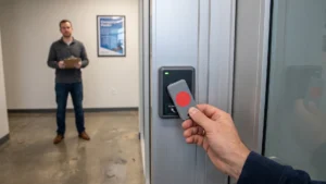
Integrating clear directional icons and concise text directly onto the token surface significantly speeds up physical interactions at your turnstiles or reader pads. When users approach a busy transaction point, they rely on these immediate visual signals to align the hardware correctly with the scanning zone. Removing any ambiguity about where to place the device reduces user errors at the hardware level and prevents the system from registering failed reads. Your technical decision-makers will see a direct improvement in the operational speed of the overall access system when the physical design supports the technical infrastructure.
Using strategic colour coding allows users to match their token visually to the corresponding terminal or access lane without reading complex instructions. This simple matching system guides individuals naturally toward the correct hardware, which is particularly useful in environments operating multiple distinct reader types. When the visual branding aligns precisely with the physical reader points, you eliminate the frustrating delays caused by users presenting valid tokens to the wrong machines. A thoughtful approach to these visual elements ensures your implementation delivers the maximum possible efficiency during peak operational hours.
Managing the final return or exit process
The conclusion of the user journey requires specific attention because temporary tokens must be returned and deactivated safely to maintain your inventory. Designing the hardware with explicit visual prompts that indicate ownership or return requirements solves the common operational problem of token loss. You can print clear return instructions directly onto the surface to remind users that the device remains the property of the facility. This proactive communication guides individuals to the correct drop-off points as they approach the exit barriers.
Aligning the token design with your physical collection bins ensures the hardware is returned properly within the system without requiring constant staff monitoring. When the colour or shape of the token explicitly matches the designated return slot, users naturally complete the deposit action as part of their departure routine. Implementing this intuitive matching process helps lower your ongoing deployment costs by drastically reducing the need to purchase replacement hardware. Your implementation team secures a sustainable operational model when the visual branding actively encourages the correct return behaviour.
Standardizing technical terms and user instructions
Translating complex technical requirements into simple, actionable instructions printed on the token ensures users interact with the system correctly. You must avoid overwhelming your audience with technical jargon like Radio Frequency Identification (RFID) or Near Field Communication (NFC) when a simple instruction will suffice. Prioritising clear communication over detailed specifications reinforces the educational mandate you will find throughout RFID & NFC guides. Standardising these instructions across your entire hardware fleet guarantees that everyone understands how to operate the system regardless of their technical background.
Defining technology visually
Replacing complicated technical explanations with universal symbols provides a much faster way to educate your users at the point of interaction. A well-designed contactless wave icon instantly communicates that the hardware uses RFID technology without requiring the user to understand how electromagnetic fields operate. You can use these visual shortcuts to bridge the gap between advanced hardware capabilities and everyday user expectations. This approach ensures your system remains accessible and prevents visitors from feeling intimidated by the underlying technical infrastructure.
Keeping instructions simple
The limited surface area on a token means you must condense your user instructions into the most direct and necessary commands possible. Printing brief phrases like “tap to enter” or “return on exit” provides immediate clarity while avoiding cluttered layouts that are difficult to read in motion. You should remove any unnecessary technical details from the printed design so the core action remains the sole focus of the user’s attention. Simplifying the language directly improves the speed of your access lanes by allowing users to process the instructions at a single glance.
Maintaining consistent terminology
Establishing a standardised vocabulary for your token deployment prevents confusion when users transition between different areas of your facility. If you refer to the action as “scanning” at the main entrance, you must use that exact same terminology at the internal security doors and the exit gates. Consistent language reinforces the correct user behaviour and builds a reliable mental model of how the entire system functions. Your project manager can use this uniform terminology to create supporting signage that aligns perfectly with the instructions printed on the hardware itself.
Planning your token rollout sequence
Finalising the physical deployment safely requires a structured step-by-step method for introducing the newly branded tokens into your active environment. You need to plan a rollout sequence that tests the physical design in real conditions without disrupting the routines of your existing user base. This measured approach empowers your implementation lead to execute the transition confidently and integrate the new hardware seamlessly with your established operational processes. Structuring your deployment in clear stages ensures you can identify and resolve any friction points before committing to a full facility launch.
- Internal testing phase: Your project team should begin by distributing the new tokens exclusively to staff members to verify that the visual instructions function as intended. This initial phase allows you to observe how the hardware performs at your actual access points without risking delays for your external visitors. You can gather immediate feedback on whether the directional cues and colour coding genuinely improve the speed of the transaction. Adjusting the system based on this internal data ensures the token design is fully optimised before the public launch.
- Parallel operation deployment: Introducing the new tokens alongside your legacy access methods allows users to transition at their own pace without feeling forced into an unfamiliar process. You can operate both the old and new systems simultaneously at designated entry lanes to monitor how intuitively first-time users handle the updated design. This controlled environment provides a safe space to evaluate the effectiveness of the printed instructions and the return mechanisms. Managing a dual system temporarily prevents large-scale bottlenecks while your audience adapts to the new physical hardware.
- Complete system transition: The final stage involves withdrawing the legacy methods entirely once you have confirmed that the new tokens facilitate a smooth and reliable user journey. You must ensure that all supporting signage and staff communications match the standardised terminology printed on the new hardware. Executing this definitive switch establishes a single, unified access protocol that simplifies your ongoing maintenance and inventory management. Your team completes the rollout with a proven, functional system that clearly guides every user from their initial arrival to their final exit.
What does token branding include beyond the logo?
Your token branding covers color, shape, material, text, icons, numbering, and tactile cues that make the token easy to spot and handle. Tie these choices to each touchpoint such as pickup, tap, carry, present, and return. Use high contrast, anti glare finishes, and consistent color coding across equipment and signs.
How do I map the user journey for a token?
Start by listing every moment a user meets the token, from seeing it at the desk to returning it at exit. Capture intent and common questions at each step, then note environment, lighting, and time pressure. Turn this into a simple storyboard and attach clear branding decisions to each touchpoint.
How do I make a token easy to use at busy gates or counters?
Use one action verb such as Tap or Insert on the token and on signs, and pair with an arrow aligned to the target. The device that reads the token is called a reader, so match its light and orientation. Keep orientation consistent across sites and reduce visual clutter.
What should I print or store on an RFID or NFC token?
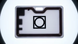
Radio frequency identification RFID and near field communication NFC tokens are chips in cards or wristbands that a device called a reader detects at short range. Print a human readable identifier and a return instruction, not personal data. Store only a unique identifier and manage permissions in your system.
How do we test token branding before a full rollout?
Prototype with a small group in real conditions and observe without coaching. Track time to first successful use, misreads, staff prompts per 100 users, and lost token rate. Compare two versions in parallel, gather comments at busy points, then iterate and retest until questions drop.