Why small token artwork requires a different design approach
Standard branding assets often fail on small tokens because they contain intricate details that physical printers cannot reproduce at a microscopic scale. When your team attempts to shrink a standard logo down to fit a twenty-millimeter surface, the ink naturally bleeds and the fine lines merge together. Small format tokens demand a completely different design approach that prioritises extreme simplicity and bold contrast over delicate visual aesthetics. Acknowledging this mechanical reality early in your project helps you instruct your designers to build artwork specifically optimized for the constraints of token manufacturing.
Adapting your logo for small surface areas
Modifying your existing brand assets for a tiny canvas ensures your final printed tokens look professional and clearly represent your organization. The goal involves breaking down your primary logo and stripping away elements that add unnecessary complexity. Taking this reductive approach guarantees that your brand remains recognizable even when it occupies just a fraction of its normal visual footprint. You can evaluate your assets using a straightforward framework to determine what stays and what goes.
Removing fine details and gradients
Gradients and fine drop shadows rely on high-resolution printing, which standard token production methods simply cannot replicate cleanly. When you print a gradient on a small plastic surface, the transition between colors becomes banded, uneven, or entirely lost. Removing these subtle effects and converting your artwork into solid, single-color shapes instantly improves the clarity of the design. This flat approach ensures that the thermal or ink-based printers can lay down a crisp image without struggling to blend microscopic dots of color.
Adjusting element proportions
Shrinking a complex logo proportionally often causes the thinner lines and smaller text elements to disappear completely. You must manually thicken thin strokes and enlarge critical shapes so they survive the transition to a small physical format. This process might make the logo look slightly unbalanced on a computer screen, but it corrects itself once printed on the actual token. Adjusting these internal proportions guarantees that the ink adheres properly without leaving faint spots or broken lines in the final product.
Choosing isolated brand marks over full lockups
A full logo lockup, which includes the brand icon alongside the company name and a tagline, crams too much information into a highly restricted space. You will achieve a much stronger result by isolating the primary brand mark or a single initial and using that as the sole visual element. Dropping the supporting text allows the remaining icon to fill the available printable area, maximizing its impact and legibility. This bold simplification helps users instantly identify the token without needing to squint at microscopic, unreadable text.
Selecting legible fonts and line thicknesses
Typography behaves unpredictably at small scales because ink naturally spreads as it absorbs into or cures on physical materials. If you choose a font with very thin strokes or delicate serifs, those lines will either fail to print entirely or blur into an illegible smudge. Selecting a bold, sans-serif typeface with uniform line thickness creates a much more reliable result during the manufacturing process. A sturdy font structure stands up to the mechanical limits of token printing, ensuring your numbers and text remain sharp.
You also need to maintain generous spacing between individual letters, known as tracking, to prevent the characters from bleeding into one another. When letters sit too close together on a small token, the slight ink spread causes them to fuse, making serial numbers or instructions impossible to read. Increasing the empty space around each character gives the printer a wider margin for error while maintaining perfect legibility. Prioritizing clear line thickness and loose letter spacing saves your team from discovering unreadable text only after a full production run is complete.
Mapping artwork around physical token features
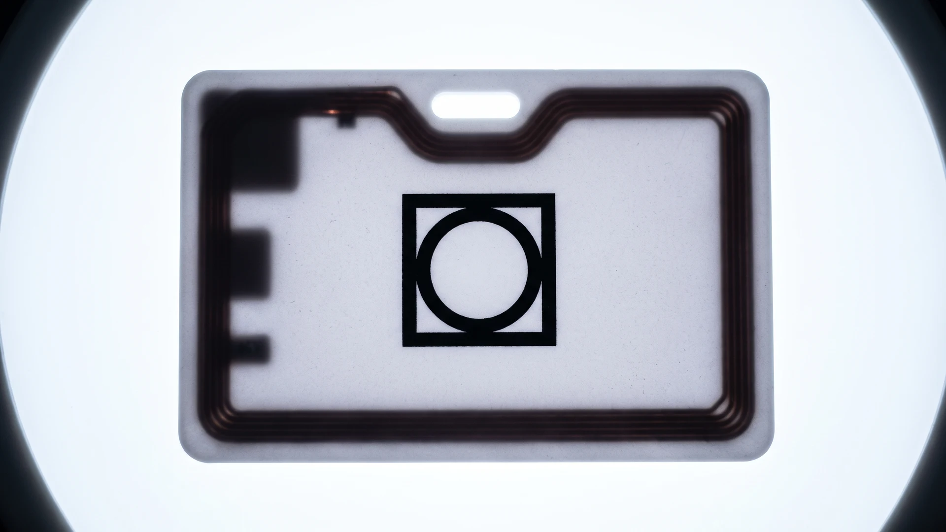
Internal hardware and structural features create uneven zones across a token where printing equipment cannot safely apply ink. You must carefully map your design around embedded chips, antennas, and punched holes to prevent critical text from distorting or being cut out entirely. Planning your layout with these mechanical constraints in mind helps your team establish a reliable safe zone before submitting files to the manufacturer. The following sequence guides you through plotting artwork around these common physical disruptions.
- Account for internal antennas: Radio Frequency Identification (RFID) chips and copper coils create microscopic bumps that prevent standard thermal printers from laying down ink evenly. Internal metal antennas also act as heat sinks, which causes uneven color saturation when using direct-to-card printers that rely on heat transfer. If the manufacturer places the antenna dead-center, you must keep fine text and barcodes away from the middle of the token. Alternatively, an edge-wound antenna preserves the center for high-quality printing but restricts full-bleed colors around the rim.
- Calculate edge safe zones: The industry standard safe zone margin for printing on small plastic hardware tokens sits between 1.5 millimeters and 2.0 millimeters from the physical edge. Keeping your artwork inside this boundary ensures you only print on perfectly flat plastic and avoid slight depressions caused by injection molding. This margin leaves you with a maximum safe printable area of roughly seventy-five to eighty percent of the total surface diameter. Respecting this mechanical alignment tolerance prevents your ink from stretching, distorting, or smearing as the printing pad rolls over the edge.
- Design around lanyard holes: Punched holes create physical constraints that require a dedicated safety radius of at least 3 to 4 millimeters beyond the hole edge. Production alignment is never perfect, meaning you must account for a shifting tolerance of up to 3 millimeters where the punch might miss its exact intended center. You must shift critical logos and text away from these top-center or corner areas so they are not accidentally sliced off. Avoiding thin borders near the hole also prevents the material from tearing under the constant physical tension of a hanging lanyard.
Maximising contrast for clarity in production
High contrast between your background and foreground elements becomes essential when printing on very small surface areas where colors naturally bleed together. If you pair a dark blue logo with a black background, the lack of visual separation causes the entire design to turn into a dark, muddy shape. Using stark color combinations, such as crisp white text on a deep background, ensures every element remains distinct and easy to read. This objective approach to color pairing guarantees that your design survives the printing process without losing its structural clarity.
You also need to consider how lighting conditions and physical wear will affect the visibility of your printed tokens over time. Subtle pastel shades or low-contrast grayscale designs often fade or become illegible once the token gets scratched from daily use. Selecting bold, highly saturated colors provides a functional buffer against environmental wear, keeping the artwork visible for much longer. Empowering your team to prioritize stark contrast over nuanced aesthetics results in a highly durable and consistently recognizable final product.
Finalising your token artwork for manufacturing
Before you send your artwork off for manufacturing, reviewing the design against the physical constraints of the token gives you confidence in the final deployment. You should verify that all fine details are removed, fonts are bold and widely spaced, and critical elements sit safely inside the printable boundaries. Adopting this rigorous checklist mindset helps you approve design proofs accurately and prevents frustrating delays during the production phase. The RFID & NFC platform encourages this structured preparation, ensuring your finished tokens integrate perfectly into your daily operations without visual or functional flaws.
How do I choose a font that stays readable on a token?
Start with a simple sans serif with open shapes and generous spacing. Avoid condensed styles and thin strokes that close up when printed small. Check the x-height, which is the height of the lowercase x, because taller lowercase letters boost clarity. Print at actual size on your chosen material.
What safe margins should I use near edges and holes?
Keep a safety zone, which is a no-print buffer, inside the token edge. Industry practice is 1.5 to 2.0 millimeters from the edge. Around a lanyard hole, add 3 to 4 millimeters beyond the cut, with 4 millimeters of material above. Allow 1.5 to 3 millimeters for punch alignment drift.
How should I plan artwork if the token contains an antenna or chip?
Map the internal chip and its antenna coil before you place artwork. A centered coil blocks the middle for fine text, while a perimeter coil can disrupt the rim for edge printing. Keep details 1 to 2 millimeters from the coil. Ultraviolet inkjet, or UV inkjet, reduces heat issues.
Which printing method is best for small details on uneven tokens?
There is no best method because surface shape and heat sensitivity decide the fit. Pad printing uses a silicone pad to transfer ink and can stretch artwork near edges. Ultraviolet inkjet sprays without contact but needs gap. Thermal transfer uses heat, and dye sublimation turns solid dye into gas.
How can I proof small artwork before production?
Print at 100 percent scale on the actual material if possible. Overlay safety zones for edges and holes, and mark any non-print areas from antennas or raised components. View at arm’s length and under poor light to check contrast. Run a short production test on the intended printer.