Why token design matters for user behaviour
When your users encounter a new access control system, they rely on physical cues to understand how they should present their credential to the reader hardware. A system error often looks like a technical failure on paper, but it frequently originates from a user holding the token at the wrong angle or tapping it against the wrong surface. By evaluating the physical characteristics of the tokens you deploy, you can guide behavior naturally without requiring extensive training sessions. This objective approach to token design ensures that your final implementation aligns with how real people actually move through your facility.
Using token colour to guide user actions
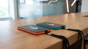
Visual communication through color coding provides one of the simplest and most effective ways to streamline daily operations across your site. When you assign distinct colors to different types of credentials, you instantly remove the guesswork that causes users to pause in front of secure entry points. This immediate visual feedback helps your project management team minimize ongoing technical support requests while establishing a clear standard for facility navigation. Color choices effectively act as an unspoken set of instructions that guide your staff exactly where they need to go.
Differentiating user access levels
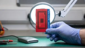
Assigning a specific color to a designated access tier allows both your security personnel and your employees to recognize permissions at a single glance. A bright red token clearly indicates visitor status, while a blue credential might represent full administrative access to sensitive areas. This clear distinction prevents unauthorized individuals from wandering into restricted zones because their access level remains visible to everyone around them. Your implementation team can easily audit physical presence during an emergency by simply looking at the token colors displayed on lanyards throughout the building.
Matching tokens to corresponding readers
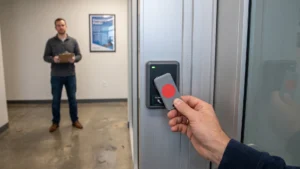
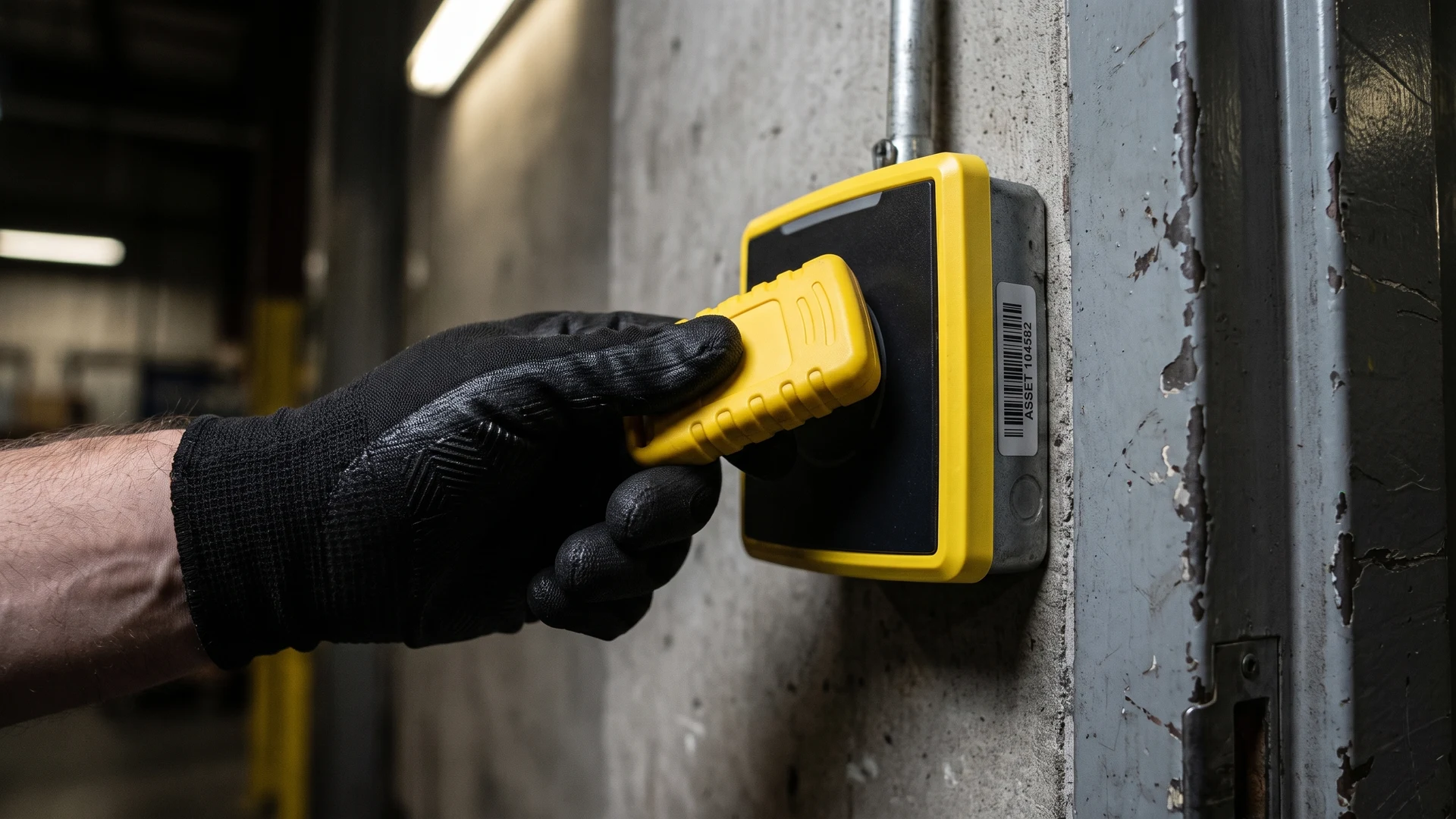
Color coordination also solves the common logistical challenge of users tapping their tokens against the incorrect piece of hardware. When a specific reader features a yellow bezel, providing a matching yellow token creates an intuitive pairing that requires no written explanation. This simple visual matching reduces hesitation and stops people from presenting a payment token to an access control scanner. You build a much smoother user journey when the physical environment naturally directs the correct action through corresponding color schemes.
Tactile cues and accessibility with edge shapes
Incorporating physical texture and distinct edge variations into your token design ensures that your access system remains accessible to everyone in your organization. Tactile feedback provides a non-visual method for users to identify their credential, orient it correctly, and use it successfully without relying on sight. This inclusive approach to enterprise implementations guarantees that your physical security measures accommodate diverse needs across all public spaces and private facilities. Thoughtful tactile design creates a smoother daily routine for your staff by turning a conscious visual check into an automatic physical habit.
Supporting visually impaired users
Tactile edge shapes specifically assist visually impaired users by allowing them to instantly tell different tokens apart by touch alone. A single notch cut into the edge might designate a front door credential, while a wavy border clearly identifies an interior office pass. This physical differentiation stops users from needing to test multiple cards at a secure turnstile or relying on a secondary device to verify their access rights. By adopting these universal design principles, you ensure that everyone can navigate transit systems and secure buildings safely and independently.
Orienting tokens for quick tapping
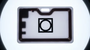
The physical shape of an NFC token dictates how your users grip and align the internal antenna with the reader hardware. Large flat cards offer a broad surface area that forgives slight misalignments, whereas key fobs with dangling weights can easily twist during a swing and cause an improper contact angle. Adding raised dots or cut corners indicates exactly which side represents the top or front of the credential. This precise physical guidance helps the user tap the correct side against the RFID scanner on their very first try, which keeps foot traffic moving smoothly.
Identifying tokens quickly by touch
When your tokens feature distinct indents, ridges, or asymmetrical edges, your users can quickly select the right credential from their pocket or bag. These familiar textures build muscle memory over time, which allows your team members to unlock doors discreetly without drawing unnecessary attention or fumbling in low light conditions. The ergonomic design naturally guides the correct hand placement so the user can interact with the reader without second-guessing their alignment. This immediate physical recognition reduces frustration and accelerates the overall speed of interaction at every secure entry point.
Preventing loss and misuse with structural cutouts
Integrating structural cutouts into your token design provides a highly practical solution to the persistent problem of lost and misplaced credentials. When a token includes a reinforced hole or a dedicated slot, your employees can easily attach the device directly to a lanyard, badge reel, or personal key ring. This physical connection drastically reduces the chances of someone dropping their token in a parking lot or leaving it behind on a desk. Securing the credential to the user’s person creates a reliable chain of custody that protects your facility from unauthorized access by opportunistic finders.
Managing lost tokens represents a significant logistical burden that drains your administrative resources and drives up long-term maintenance costs. Every time your project manager has to issue a replacement credential, they must spend valuable time updating the central database and invalidating the previous access rights. By choosing a token design that inherently supports secure attachment methods, you actively protect the overall integrity of your security system. This simple hardware decision minimizes your ongoing operational expenses and keeps your focus on productive tasks rather than constant equipment replacement.
Steps to choose the right token design for your environment
Selecting the ideal physical credential requires a careful evaluation of your unique operating environment and the specific needs of your workforce. You can build a highly reliable infrastructure by mapping out the exact user journey and identifying where physical friction currently slows down access. Breaking the decision process into clear, actionable stages helps your implementation team choose hardware that naturally complements your existing daily routines. Following a structured assessment ensures that your final rollout solves actual logistical challenges rather than just checking technical boxes.
- Evaluate your existing user workflows: Before you review any hardware specifications, you must track exactly how your employees interact with your current access points throughout a typical shift. Documenting these routines helps you identify whether users carry items that prevent them from holding a standard card, or if they need a hands-free solution entirely. This workflow analysis reveals the specific moments where a poorly designed token might cause delays at a high-traffic turnstile or a busy warehouse entrance. Understanding these operational realities allows you to select a token format that genuinely supports your team instead of forcing them to change their habits.
- Assess the physical operating environment: The physical conditions of your facility dictate the durability and visibility requirements for any credential you plan to deploy. If your team operates in a low-light industrial setting, you will need brightly colored tokens or distinct tactile ridges to help users locate their credentials quickly. Environments that require heavy protective gear might necessitate larger fobs that a worker can easily grip while wearing thick gloves. Mapping out these environmental constraints ensures that your chosen hardware performs consistently regardless of the surrounding lighting, temperature, or physical obstacles.
- Define accessibility and orientation requirements: Inclusive design must remain a priority during your selection process so that every member of your organization can navigate the facility independently. You need to determine if your reader hardware requires a specific tapping angle, and then choose a token with structural cues that guide the user’s hand into that exact position. Adding physical indicators like cut corners or textured surfaces guarantees that visually impaired users can confidently operate the system without requiring external assistance. Establishing these accessibility standards early in the project protects your investment and ensures a universally accommodating rollout.
Improving system reliability through thoughtful design
Matching visual and tactile cues to your specific environment ultimately transforms a standard technical deployment into a highly reliable access system. When you consider the physical user experience alongside the internal technology, you empower your staff to interact with the hardware confidently and correctly every single time. The educational resources provided by RFID & NFC aim to equip you with this exact framework so you can make objective, informed decisions for your upcoming rollout. By prioritizing thoughtful token design, you build a resilient infrastructure that minimizes user error and supports your operational goals for years to come.
How should I choose token colours so people pick the right reader?
Start by mapping each function to a distinct colour, then limit the palette to a small set so cues stay clear. Choose high contrast against the token body and the reader environment. Test under your real lighting. Add a simple icon for colour vision deficiency.
Which edge shapes or cutouts make tokens easier to orient by touch?
Choose asymmetrical edges that can be felt instantly, such as a single notch for the front face or a chamfered corner for the top side. Raised dots or lines help users align the correct side to the reader. Keep edges smooth. Maintain one pattern per function sitewide.
How can I validate that my colour and shape choices reduce misreads at the RFID reader?
Use a field test with timed taps and misread counts at the radio frequency identification reader, then compare before and after. Randomise order and include rush conditions, gloves, and poor light. Track error rate per a fixed number of taps and time to first successful read. Capture user comments immediately.
Is colour alone enough to guide use for low vision and gloved hands?
Colour alone often fails in glare, low light, or for users with colour vision deficiency. Pair colour with tactile cues such as a notch, a cut corner, or raised dots so alignment is unambiguous. If the token is powered, add a click or vibration. Passive tokens rely on touch alone.
Do thickness and unusual shapes affect read reliability for NFC and RFID tokens?
Yes, thickness and shape affect reliability for near field communication and radio frequency identification. Extra thickness can hold the antenna, the conductive loop inside the token, farther from the reader, which weakens coupling. Curved wearables and swinging fobs misalign easily. Add a flat contact area and clear orientation marks.