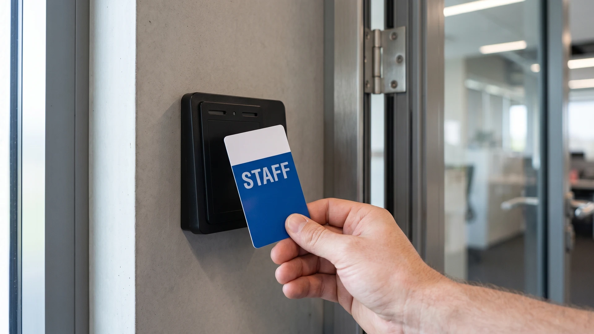
Why visual token branding matters for access control
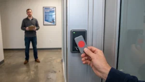
Applying specific visual branding to your access tokens gives your staff an immediate way to identify who belongs in which area of your facility. Instead of relying solely on backend systems to verify permissions, a quick glance at a token’s color or design instantly confirms a user’s role. This clear visual separation simplifies daily operations for project managers who need enforceable rules that do not require complex technical checks at every doorway. By keeping the visual indicators distinct and easily recognizable, you create a physical layer of security that complements your digital infrastructure perfectly.
Keeping your access rules secure and hidden
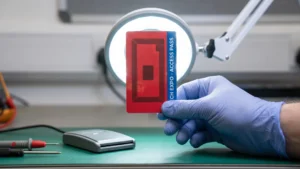
While visual branding improves usability, you must carefully avoid exposing technical specifications like Radio Frequency Identification (RFID) or Near Field Communication (NFC) chip types on the physical tokens themselves. Attackers can exploit visible technical details, such as printed card numbers, facility codes, or manufacturer logos, to clone credentials and bypass your physical security. When an RFID token displays specific microchip branding or part numbers, it instantly signals to bad actors whether the system uses basic static memory or advanced cryptographic protection. Keeping these technical configurations out of plain sight protects the integrity of your underlying database systems from targeted digital attacks.
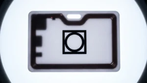
The physical form factor and casing of your tokens also play a crucial role in concealing the internal architecture from unauthorized inspection. A standard thin plastic card allows easy proximity scanning, whereas embedding the chip inside resin or tamper-evident housings makes non-destructive probing much more difficult. If attackers can identify the antenna size or coupling mechanism visually, they can determine exactly what kind of specialized long-range reader they need to extract data. By removing all visible technical identifiers and relying entirely on secure coprocessors for dynamic verification, you ensure that the physical token never gives away the backend logic.
Visual strategies for staff, visitors, and customers
Customizing your tokens for different audiences requires a thoughtful balance between clear visual recognition and professional aesthetics. You can distinguish your primary user groups instantly without printing explicit access levels or technical labels on the credentials. By establishing specific patterns for your internal team, temporary guests, and valued clients, you streamline the identification process for everyone involved. The right combination of colors, abstract designs, and minimal text ensures that your access management remains discreet but highly effective.
Color coding for immediate staff recognition
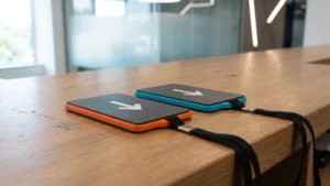
Assigning bold and highly visible colors to your employee tokens creates an instant recognition system for your security personnel. When staff members wear lanyards or carry fobs in a designated corporate color, unauthorized individuals in restricted zones stand out immediately. You can further segment internal departments by assigning specific color variations to maintenance, technology, or management teams without printing their actual job titles. This color-based approach keeps sensitive organizational structures private while allowing security teams to enforce access boundaries confidently.
Abstract artwork for discreet customer access
Providing access tokens to paying customers requires a more subtle approach that prioritizes a premium experience over obvious security markers. Using abstract artwork or elegant geometric patterns allows you to separate client tokens from staff credentials without making the customers feel like they are wearing high-security badges. You can incorporate subtle branding elements that align with your corporate identity, ensuring the token looks like a membership perk rather than a strict control device. This sophisticated design strategy maintains the necessary visual separation while keeping the customer experience welcoming and professional.
Text guidelines for temporary visitors
Managing temporary visitors requires clear guidelines that prioritize immediate identification without giving away permanent access rights. You should print minimal text, such as a large “V” or a simple expiration date format, to indicate that the credential holds temporary status. Avoid including detailed instructions, facility maps, or specific return procedures on the token itself, as these details can compromise security if the credential is lost. By keeping the printed information sparse and highly specific to the visit, you maintain tight control over temporary access while ensuring reception staff can process guests quickly.
Steps to deploy your branded access tokens
Rolling out a visually distinct token strategy requires a structured sequence to minimize disruption to your current workflows. Before you introduce the new credentials, you must map out exactly where your existing identification processes encounter friction or confusion. Once you identify these operational gaps, you can execute a phased deployment that replaces outdated credentials systematically. Following a concrete implementation process ensures that your project managers can scale the visual separation method across all access points confidently.
- Audit your current user groups: Begin by categorizing everyone who interacts with your facility into broad groups like staff, visitors, and contractors. You need to determine exactly which physical zones each group requires access to during a standard operational day. This initial audit provides the foundation for assigning specific visual cues to each distinct access profile.
- Select distinct visual identifiers: Choose specific colors, patterns, and minimal text layouts that will represent each user category clearly. You must ensure that these designs do not clash with each other or blend into standard corporate attire. Testing these visual choices under your facility’s normal lighting conditions prevents misidentification by your security personnel later on.
- Remove exposed technical data: Strip away any visible technical specifications, such as printed frequencies or manufacturer logos, from your proposed token designs. You must verify that the final artwork conceals the underlying hardware capabilities to protect against cloning attempts. This step secures your system integrity by keeping the physical credential completely decoupled from the digital backend logic.
- Phase the token distribution: Issue the new visually branded tokens to one specific user group or department at a time rather than attempting a facility-wide swap. You should start with internal staff to test the recognition process before rolling the system out to temporary visitors or customers. This phased approach allows you to address any minor confusion immediately without overwhelming your security desk.
- Train staff on visual recognition: Educate your front-line employees and security teams on what each color and pattern represents within your new access framework. You must instruct them on how to respond when they spot a token in an incorrect zone, ensuring the visual cues translate into actual enforcement. Clear training ensures that the new physical security layer functions exactly as intended from the first day of deployment.
Aligning token design with your existing systems
Scaling your new visual token strategy works perfectly without requiring you to replace or overhaul your current access control infrastructure. Because the visual separation relies entirely on the exterior design of the credential, the internal microchips still communicate with your existing readers exactly as they did before. You can simply order the specific frequencies and protocols your backend software already understands, housed within your newly branded casings. As highlighted in educational resources across RFID & NFC, this objective approach to token management allows you to upgrade your physical security layer while maximizing the return on your previous technology investments.
How do I design token artwork that clarifies roles without exposing the tech?
Lead with role-first visuals a person can verify quickly, and keep technology out of sight. Use clear color bands, large text like STAFF or VISITOR, and simple icons together. Radio frequency identification (RFID) and near field communication (NFC) details should stay hidden inside the token.
What information should never be printed on a token?
Do not print chip frequency, card numbers, facility codes, serial numbers, or chip model names. These details make it easier to clone a token or impersonate staff because they seem official. Keep visible data to role labels and a random token identifier that only your system understands.
Are manufacturer-branded tokens a risk in secure environments?
They can be, because visible logos and part numbers reveal the chip family and security level, which invites targeted attacks. Prefer neutral or custom housings that show only your role artwork, not vendor model names. If branding must stay, cover it with a tamper evident overlay that shows damage.
How should we handle visitor and contractor access tokens?
Issue distinct tokens with limited permissions and short lifetimes, and make them visibly different from staff. Print VISITOR or CONTRACTOR in large text, include return instructions, and assign them through a sign in process with a named sponsor. In your system, restrict doors and times, then collect tokens on exit.
How do we test and roll out a new branding scheme across sites?
Run a pilot in one area, then observe real use at busy times and in low light for quick recognition. Measure misidentifications, test with people who have color vision deficiencies, and pair colors with text and icons. Update guard posts, signage, and training, then audit after launch and adjust.